Lizmap Web Client Worshop - Creating interactive data visualization#
Pre-requirements#
This workshop is designed for QGIS users.
- QGIS 3.44
- Latest Lizmap plugin on QGIS Desktop
- Lizmap Web Client 3.9.X
QGIS UC 2026#
Presentations from 3Liz talking about QGIS Server during this QGIS UC :
- Today, Monday October 5
- "QJazz - QGIS Server ready for the cloud": 4:30 PM, room Pegna
- Tuesday October 6
- "Lizmap Web Client: next steps": 9:30 AMn room Hangar
- "Managing a topological county road 🚗 network: linear referencing with QGIS & PostGIS": 2:00 PM, room Bridge 2
Lizmap related Links#
- Demo https://demo.lizmap.com
- Lizmap cloud out-of-the-box https://www.lizmap.com
- PDF/HTML presentations and videos https://docs.3liz.org/talks/#lizmap
- Discourse channel https://discourse.osgeo.org
- Social accounts :
- Mastodon https://mapstodon.space/@LizmapForQgis dedicated to Lizmap
- Bluesky https://bsky.app/profile/lizmap.com
- Source code
- Lizmap Web Client https://github.com/3liz/lizmap-web-client/
- Lizmap QGIS Desktop side https://github.com/3liz/lizmap-plugin/
- Lizmap QGIS Server side https://github.com/3liz/qgis-lizmap-server-plugin
- 3Liz https://github.com/3liz/ for QGIS Server plugins, Lizmap modules
- National user group
- Stafe of translations
Documentation#
- https://docs.lizmap.com/
- Check the architecture and manuals
- Dataviz documentation https://docs.lizmap.com/current/en/publish/lizmap_plugin/dataviz.html
Discover the data#
Land use polygon layer from "Le Grand Narbonne" open-data website: format FlatGeoBUF (.fgb extension)
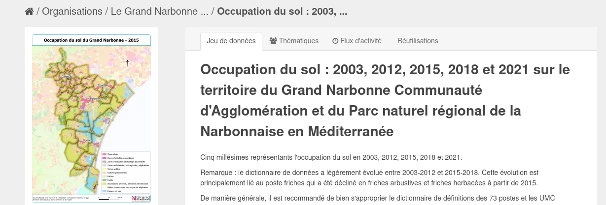
Direct access (no need to download these files at the moment):
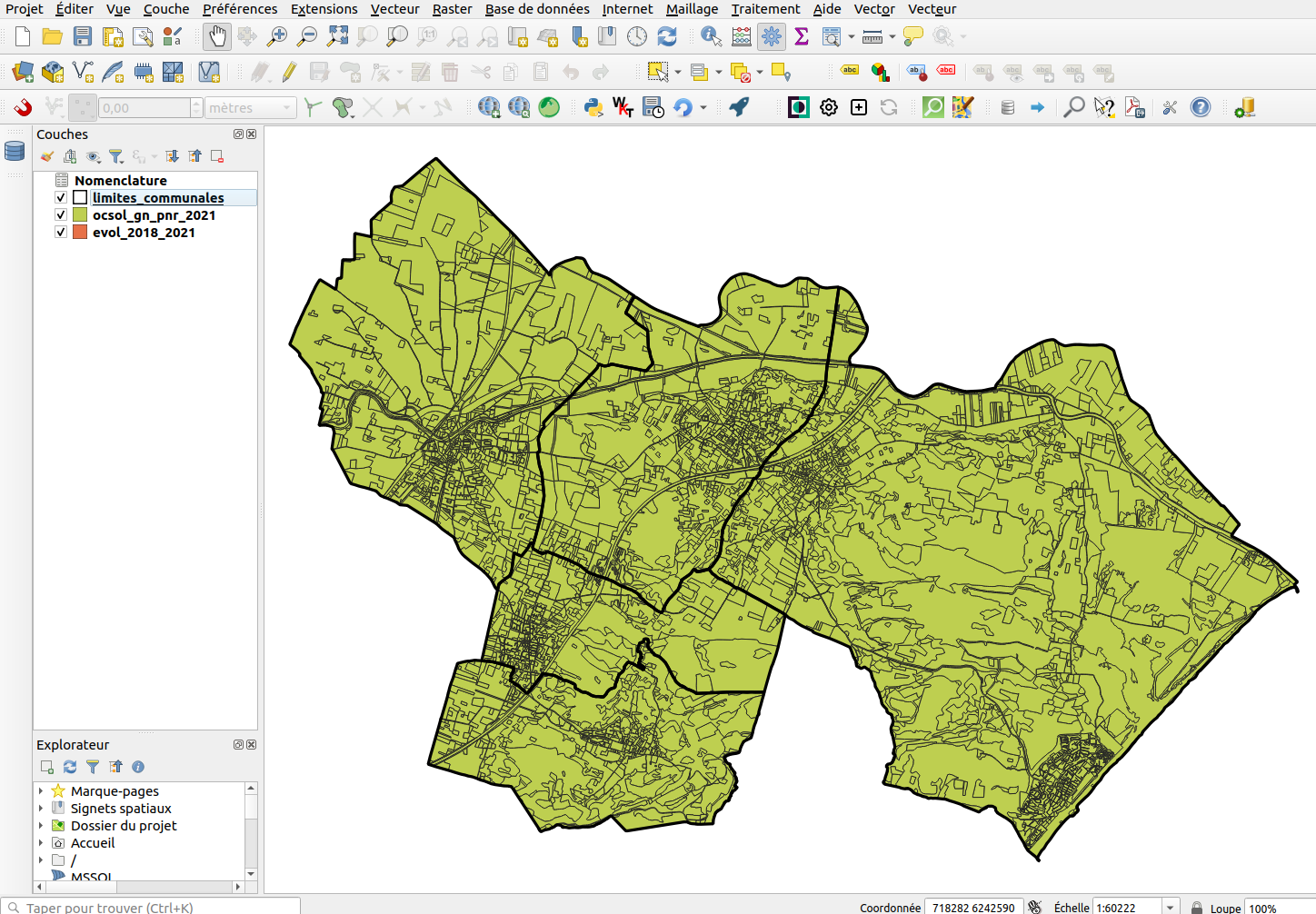
Raw data displayed in QGIS:
Setting up the training#
- Install the Lizmap extension on your QGIS Desktop. Menu Extension
- Open it, either from the toolbar, or from the Web menu
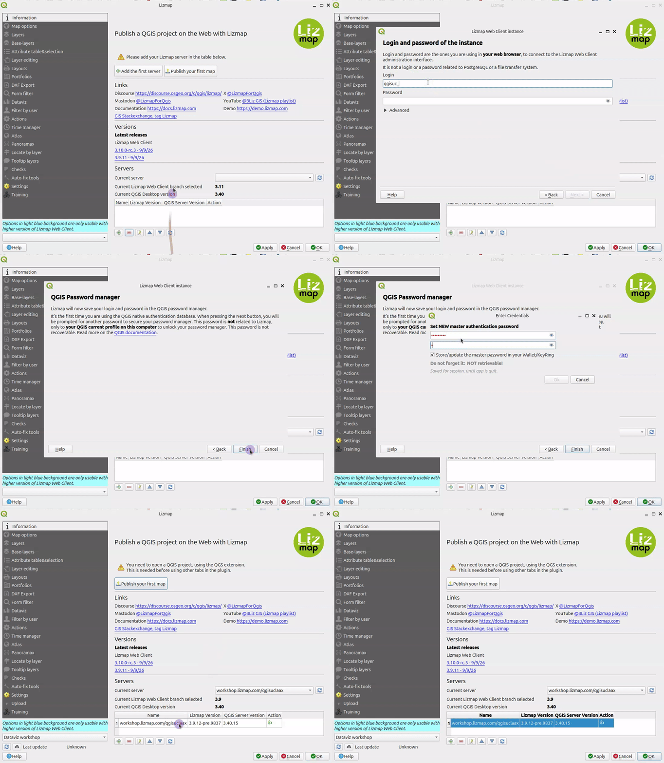
- Click Add your first server or the + icon at the bottom
- Fill the wizard :
- URL : https://workshop.lizmap.com/qgisuclaax/
- Login :
qgisuc_X, replaceXby your number (ex:1or14) in login and password. For exampleqgisuc_4 - Password : same as the username
Warning
QGIS might ask you to set up a master password. This password belongs to you and is not linked to Lizmap. It's to lock your internal QGIS password manager.
Question
Is-it 👍 or something else ?
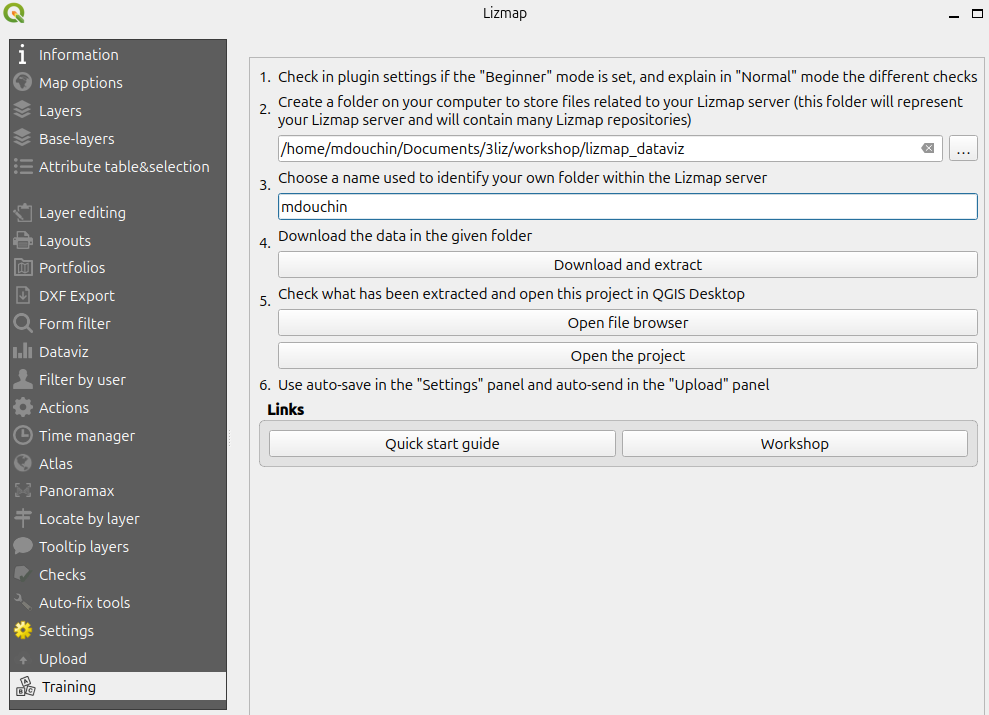
Now you should be able to go to the Lizmap plugin Training tab (the last one at the bottom of the left menu), fill the form, and click the Download and extract button, then Open file browser
Info
Please open the newly created QGIS project in QGIS.
Info
This short workshop was designed for 90 minutes, so some steps in the QGIS downloaded project are already done.
The workshop QGIS project#
The QGIS project demo_XXXX.qgs built for this shot workshop:
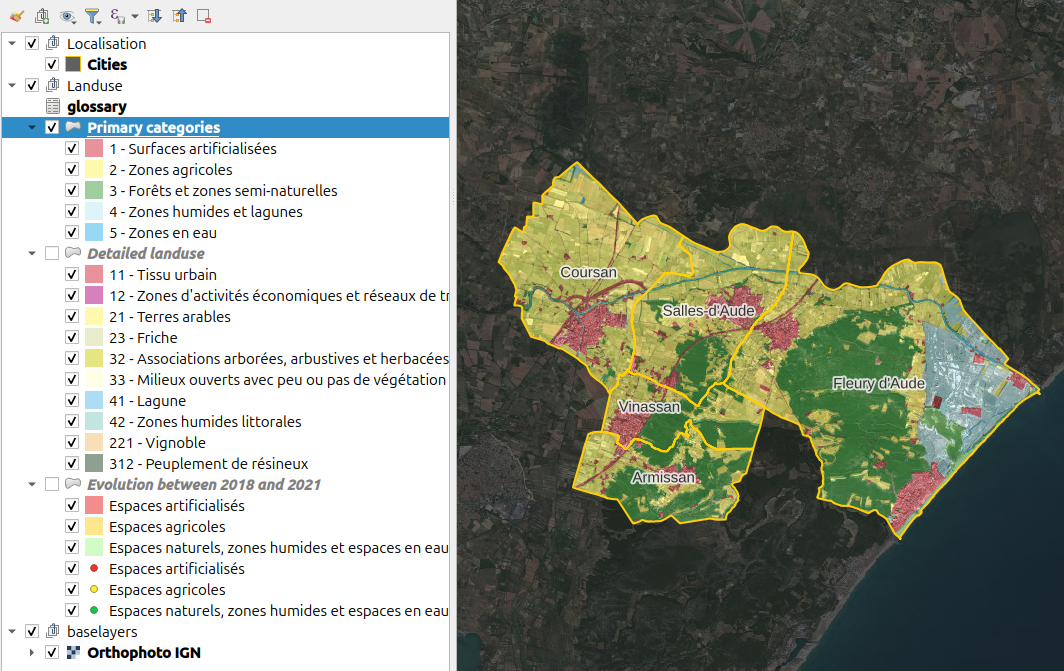
- shows the data organized in a layer tree
- the layers have been styled based on the given metadata (colors corresponding to the land use categories)
- Each land use data layer has
- a
code_inseefield, which is the unique code of one of the 5 cities. - a
colorfield containing the color of the corresponding category. It is based on a QGIS expression using the field from a join with theglossarylayer.
- a
- the group Land use have been configured to let only one layer visible at a time (mutually exclusive)
- relations have been set up in the QGIS project properties dialog (links between cities and the other layers)
- A aerial photo layer has been added as a background layer
First Lizmap publication#
Info
Please open the QGIS project if it is not done yet
You can open the Lizmap plugin : menu Web / Lizmap or click the icon in the web toolbar.
- In the Layers tab, make some layers visible by default
- Click on the
Applybutton. - Skip the dialog First Lizmap configuration.
- Applying will save a Lizmap configuration file in the same folder as your QGIS project. For example
demo_qgisuc_1.qgs.cfgif your project name isdemo_qgisuc_1.qgs. - At the bottom left, let's choose the remote directory where to send this project
- Send the project to the server with the button
Upload on the server - Visit your Lizmap project map in the web browser: https://workshop.lizmap.com/qgisuclaax/index.php
Plot configuration#
With the dataviz panel of the Lizmap plugin, you can create a few kinds of graph with only a few clicks: scatter, pie, histogram, box, bar, histogram2d, polar, sunburst, HTML
You can add as many plots as needed.
Each plot is based on the data of a QGIS vector layer.
To add a new plot in your Lizmap project map, we will soon use the following steps:
- Click on the + button
- Select the type of chart to add. Use
barorpie. (histogrammust rarely be used !) - Title : Here you can write the title you want for your chart.
- Description : The description of the chart. You can include HTML.
- Select the vector layer in the drop-down list.
- X field : The X field of your graph. It is the base configuration used for creating groups of data (dates, city codes, categories, etc). (It might be empty for a few types, e.g. box plots)
- Aggregation : Lizmap will aggregate the data, grouped by unique values of the X field. There are a few aggregate functions available -
average(avg),sum,count,median,stddev,min,max,first,last. - Traces : You can add one or many traces : the Y field(s) of your graph. They represent the value to be ploted. If more than one value in the chosen Y fields share the same X value, they will be aggregated.
Additional plot options#
- Layout : The layout can be customized. It must be a JSON dictionary. You can read the documentation of Plotly about the layout configuration
- Display filtered plot in popups of parent layer : if you check this checkbox, the children of your layer will get the same graph as the parent plot but filtered only for them. It's useful if you want to see the statistics of one entity instead of all.
- Only show child popup : The main graph will not be shown in the main container and only the filtered graph of the relation of the layer will be displayed in the popup when you select the element.
- Display the legend, sometimes, the legend is not necessary.
- Display plot only when the layer is visible.
Info
Some options might be visible or not according to the kind of chart, like choosing for horizontal/vertical layout for a bar chart.
Create our first plot: a pie chart with the main landuse categories#
We want to add a Pie chart from the layer "Main categories". In the Dataviz tab of the Lizmap plugin, add a new chart, and configure it:
- Choose the
Pie charttype - Write a simple title
- Choose the layer
Primary categories X Field: Use theNiveau 1(level 1) field which contains the label of the main category of land use for each polygon- Use
Sumfor aggregation - Add one trace with
- the Y field
Surface (ha)which contains the polygon area in ha (real number) - the color field
colorwhich contains the color corresponding to the level 1 land use - Validate with
OK
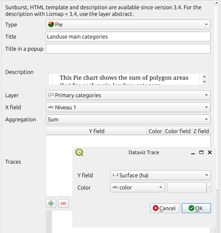
The Lizmap plugin table inside the Dataviz tab now shows the configured plot

Apply, and send your project & lizmap configuration
Go to your map, and see the result
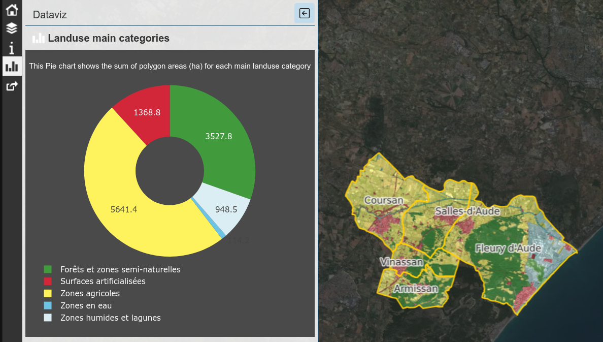
A bar chart with more detailed land use categories#
We would like to show a bar chart of the Level 2 categories, displayed by descending total of surface.
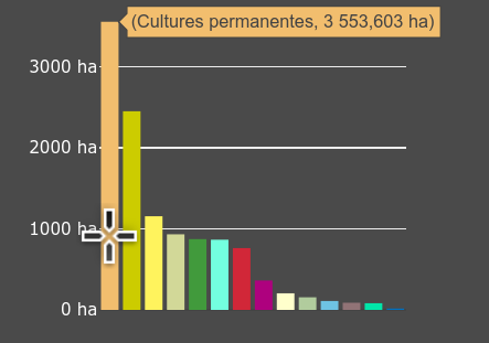
Lets configure the bar chart, layer `Detailed landuse
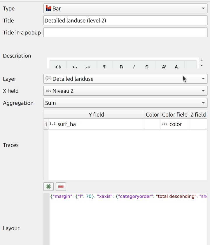
Here is the JSON to add in the layout
1 | |
Also uncheck the checkbox Display the legend
and check the checkbox Display plot only when the layer is visible
Info
Once configured, you can also apply & send, to see the result in Lizmap Web Client
A special & versatile plot type: the HTML plot#
This type of plot allows creating and styling your own content based on the source vector data.
Principle : you can use the HTML language, as in some parts of QGIS (print layouts, labels, etc.) to create your content.
Lizmap will automatically replace variables {$x} with the values from the X field and {$y1}, {$y2} from the aggregated values of the traces (Y) data.
Let's configure it with Lizmap plugin
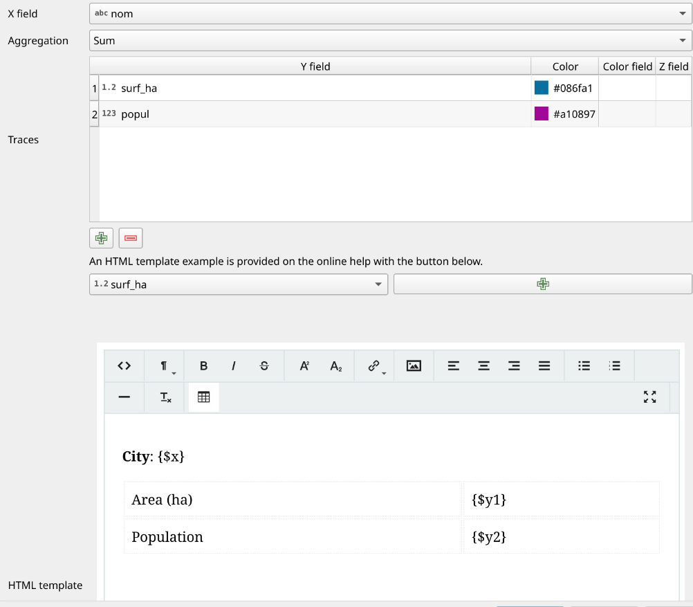
Result:
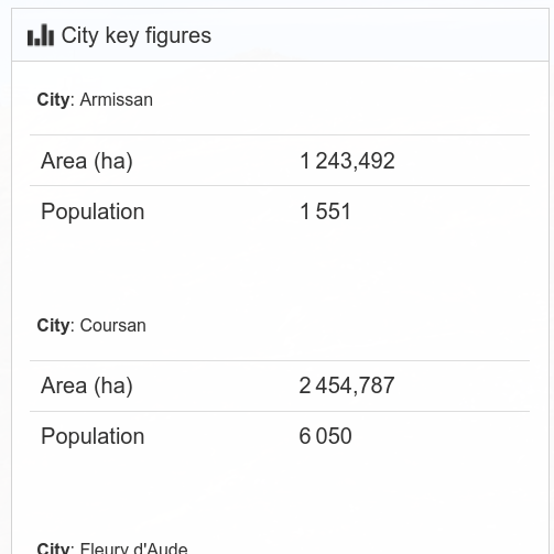
You see Lizmap will display one HTML block per X unique value.
If you want to sum up all data (but loose the City name),
you could use depart for the X field (which is unique across all cities)
and remove the line City: {$x} from the HTML template.
Plots filtered in the City popups#
Lizmap allows the user to click on the map and get the object data,
as QGIS does with the Identify features map tool.
In the Lizmap plugin Layers tab:
* Select the layer Cities in the layer tree
* Under the group layer tree options, check the checkbox Popup
and select the radio button No children displayed
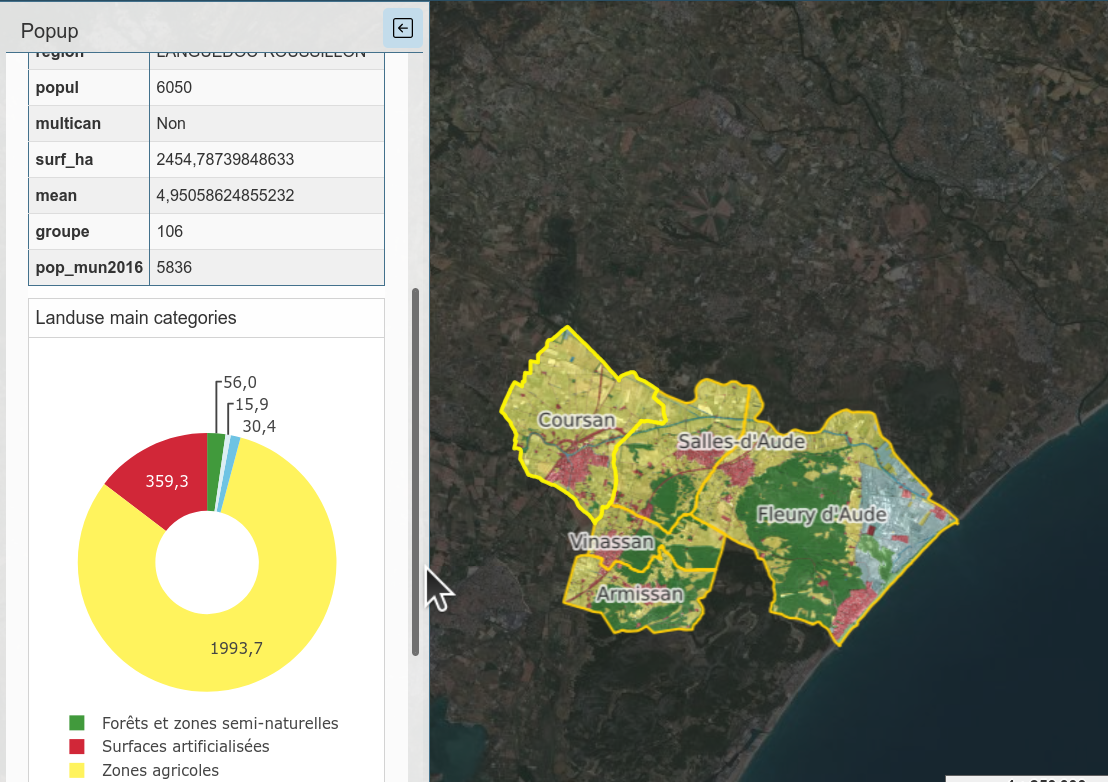
Then Apply & send, and see the result: when clicking on a city, the popup is displayed, and show a table of all the fields aliases & values for this city.
Info
You can completely configure the content of Lizmap popup. See more information in the documentation
Now, we would like to show the filtered plots under the City popup, showing only the data for this city.
To do so, we only need to check the checkbox Display filtered plot in popus of parent layer
in the plot configuration

Then, save & publish, and click again on a city in Lizmap Web Client.
Add filtering capability#
We have already defined relations in the QGIS project properties between the layer Cities and the land use vector layers.
Configure the attribute tables for the parent and the child layers in Lizmap plugin.

Add the tool Locate by layer for the parent layer Cities and set it to trigger the filter on change.
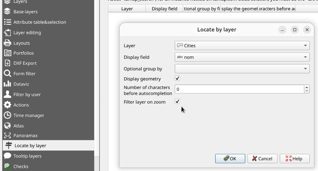
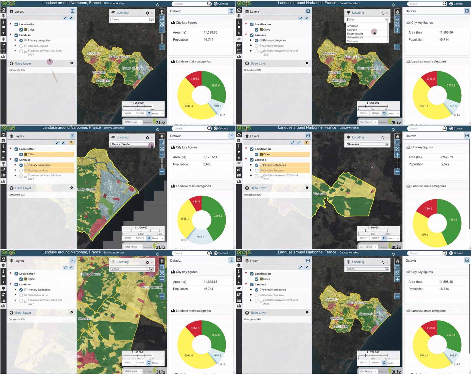
After applying these configurations, and publish it to the server, you will then be able to select a city with the combo box in the top-right corner of the map, and Lizmap will:
- zoom to the city,
- show only the polygons related to this city,
- and filter the plots accordingly
Conclusion#
😎 Thanks for your participation